
Component Library
This represents a listing of all current component (pattern, inline block, Layout Builder block) types and their options and modifiers.
Nearly all patterns provide universal modifiers:
- Color Theme: Sets a brand-legal color stack for the entire pattern
- Background Color: Sets the brand-legal background color for the entire pattern
- Background Graphic: Applies a brand-legal background graphic to the entire pattern
- Hide Block: Hides the block from all views save for the Layout edit view. This is typically used for staging content or temporarily hiding content.
- Layout Modifier: Sets outer-most internal spacing of pattern
- Size Variant: Sets the height of the entire pattern to fill the height of the browser or to only be as tall as its contents require
Campaign Components
Callouts & Video Component Title

Callout Description


Fifty-Fifty Contained Component Title

Three-Up Tiles Campaign Component Title


Knowledge Hub Components
Knowledge Hub: Three-up Card Component Title
This pattern is intended for the Knowledge Hub section. It allows an unlimited quantity of cards that each collect a product title, product icon, title, description, and link. The entire pattern also collects a title, description (this field), link, and background image.

Single Column Components
This follow excludes the follow pattern as they consist of fixed-content/-styling and/or are campaign-specific and therefore not modular/pattern repeatable:
- Campaign Jumbotron
- Connect
- Course Schedule
- Event Schedule
- Jobvite Embed
Contained Hero CTA Component Title
This pattern collects a title, link, description, and background image. Various options are available to adjust the background image and colors.

Contained Hero Intro Component Title
This pattern collects a title, description, no more than two links, and background image.

Container Promo Strip Component Title
This pattern collects a title, image, and link.
CTA Strip: This pattern collects a title, two links or less, and background color/layout modifier options.
Data Point Component Title
This pattern collects an unlimited quantity of data points that each collect a value and label. The value can be animated to "count up". The pattern as a whole collects a title, description (this field), and background image or video.
-
100%
Data Point Label
-
$80M
Data point label as WYSIWYG with a link
-
123
Demo Request Title
This pattern collects a Marketo form ID (which then renders a Marketo form in an iframe), as well as a title, description (this field), and list items (rich text).
- Demo Request List Items
- Another list item
- This field is a Full HTML WYSIWYG so can be more than just a bulleted list
Request a Demo Form
This pattern collects a title, description (this field), two links or less, and the usual background color and layout modifier options.
Featured Asset Component Title
This pattern collects a title, eyebrow, description (this field), link, inline image, and background.


Featured Event/Webinar Strip Component Title
This pattern collects a title, description (this field), link, and image.
Featured Post Carousel Component Title

Full Width Slide Heading


Gartner Review Component Title


Bullet Point Description


Bullet Point Description

Hero - Static Component Title
This pattern collects a title, description (this field), images (background, featured, and inline), and no more than two links.
Hero with App CTAs Component Title
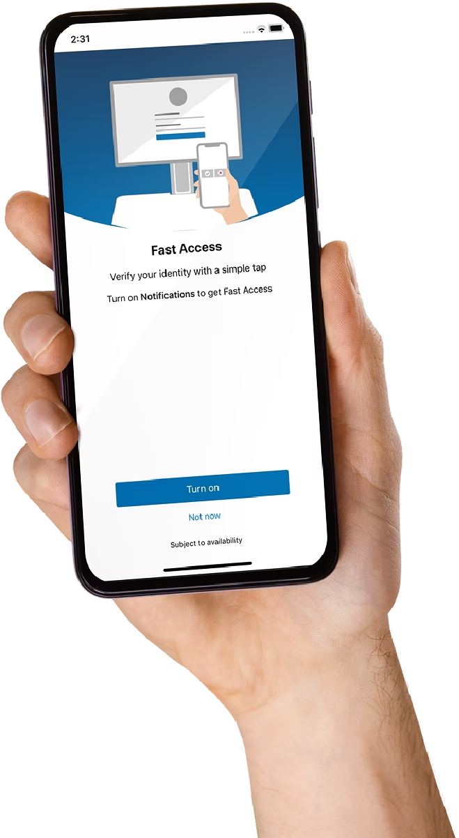
This pattern allows an unlimited quantity of badges that each collect an image and link. The whole pattern collects a title, description (this field), inline image, and "app variant".


Icon Strip Component Title
Icon Strip Section Title


Industry Illustrated Carousel Component Title
Industry Illustrated Slide Title
Industry Illustrated Slide Title


Infographic Component Title


Intro & Data Component Title
This pattern collections a section title, description (this field), quote (image, quote, byline), and a data section with a secondary title, description, two links or less, and a nested Data Point component (see above).
Intro Section Component Title
This pattern collects a title, eyebrow, description (this field), and no more than two links.
This pattern collects a title, description (this field), and a Marketo form ID (that loads a Marketo form in an iframe).











This pattern collects a title, description (this field), image, no more than two links,and a background image.
Product Showcase Component Title
This pattern collects an unlimited quantity of cards that each collect an image, title, description, and link. The entire pattern collects a title and description (this field).


A simple pattern that collects an image, title, and caption. Image orientation allows you to full-width bleed the image or contain it flush left/right with sibling content.
Table of Contents Component Title
Similar to the WYSIWYG pattern this collects a title and rich text editor. This allows you to create a bulleted ToC:
Timeline Year
Timeline Title
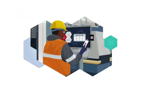
This pattern creates a timeline with unlimited entries. Each entry collects a year, title, blurb, image, and allows you to modify the visual look of the entry.
Upcoming Courses Component Title

Customers for life
At Imprivata our goal is to deliver a signature experience, based on providing value through positive outcomes, that ensures we create customers for life.

Courage of your convictions
We want employees to have a voice and step outside of their comfort zone to challenge the norm, change the game, and make their mark.

Integrity
We strive to do right by our employees and our customers. We hold ourselves to high standards and treat each other with respect.

Passion
The passion that our employees bring to work every day creates an undeniable energy that drives us to transform the healthcare industry.

High performing teams
Video Component Title
This pattern collects a video (remote), eyebrow, and up to two links.


This pattern collects a video, optional support images (background and inline), description, and up to two links for the whole section. Additionally, this provisions a sub-section for bullets that each collect a call-to-action.
This is a left column with a description and call-to-actions.
Another optional WYSIWYG for "Right Column"
Two Column Components
Accordion with Image Component Title


Asset List Component Title


Asset 2 Title
Asset 2 Description


Featured Blog Post Component Title
This pattern collects an unlimited quantity of references to articles/blogs (but it is suggested to include at least three).
Fifty-Fifty Media & Text Component Title
This pattern collects a description (this field), title, and media (image or video) for an adjacent column. You can change the orientation of both.
This pattern is similar to the above but only offers rich text per column.
Fifty-Fifty Text Description
Flip Card Component Title
This pattern collects an unlimited quantity of flip cards. Each card provides a front (includes an image) and back, each with a rich text field and link.

This pattern collects an unlimited quantity of callout/cards. Each card collects an image, title, description, and link. The section as a whole collects a description (this field), title, image, video, and no more than two links.


Intro with Bullets Component Title
This pattern collects an unlimited quantity of bulleted items. Each collects a title, description, and link.
Intro and Challenges Component Title
This pattern collects an unlimited quantity of bullet points. Each collects a title and link.
-
Bullet Point Title
Bullet Point Link -
Bullet Point 2 Title
Bullet Point 2 Link -
Bullet Point 3 Without A Link
Two Column WYSIWYG Component Title
This pattern collects two columns: each includes a rich text field. Layout options are available to change the size of each column and their positioning between viewports.
This is the right column. This pattern is currently set to default sizes and positioning.
Two-Up Card Component Title
-
-

Two-Up Card 2 Title


Two-Up Grid Component Title


Two-Up Image & Text Component Title
This pattern collects up to two images or a Lottie animation. As a section this collects a title, description (this field), and up to two links.


Vertical Tabs Component Title


Tab Panel 2 Header
Tab Panel 2 Body

Tab Panel 3 Header
Tab Panel 3 Body
Video Grid Component
This pattern collects an unlimited quantity of videos. Each collects an eyebrow, title, video, and optional thumbnail.
50/50 Bullet Card List Component Title
This pattern collects an unlimited quantity of bulleted items that each collect a title and link.
Three Column (And More) Components
This pattern collects an unlimited quantity of list items. Each collects a title and description.
List Item 2 Description
Event Cards Component Title




Four-Up Cards Component Title

Four-Up Card Description
Tooltip Description


Numbered Cards Component Title
This pattern collects an unlimited quantity of cards that each collect a title and description.
Numbered Card Description
Numbered Card Description
Numbered Card Description
Solutions Tabs Component Title


Tabs Component Title
This pattern collects an unlimited quantity of tabs that each collect a title, description, and nested Tiles pattern.
Three-Up Tiles Component Title
This pattern collects an unlimited quantity of tiles. Each collect front and back titles and descriptions.
Three-Up Card Component Title


Three-Up Hover Card Component Title

Three-Up Hover Card Title

Three-Up Hover Card Title

Three-Up Hover Card Title
Tiles Component Title
This pattern collects an unlimited quantity of tiles. Each collects an image, preheading, value, title, description, and link.
Marketo Form Embed Component Title

Pillar Components
Pillar Bullets Title
Pillar Bullets Description
This pattern simply collects a title and two rich text fields. This field is optimized for list items.
- Bullet one
- Bullet two
- Bullet three
Pillar Hero Component Title
This pattern collects a title, description (this field), eyebrow, and body.
Pillar Hero Eyebrow
Pillar Hero Body